VB&K Law
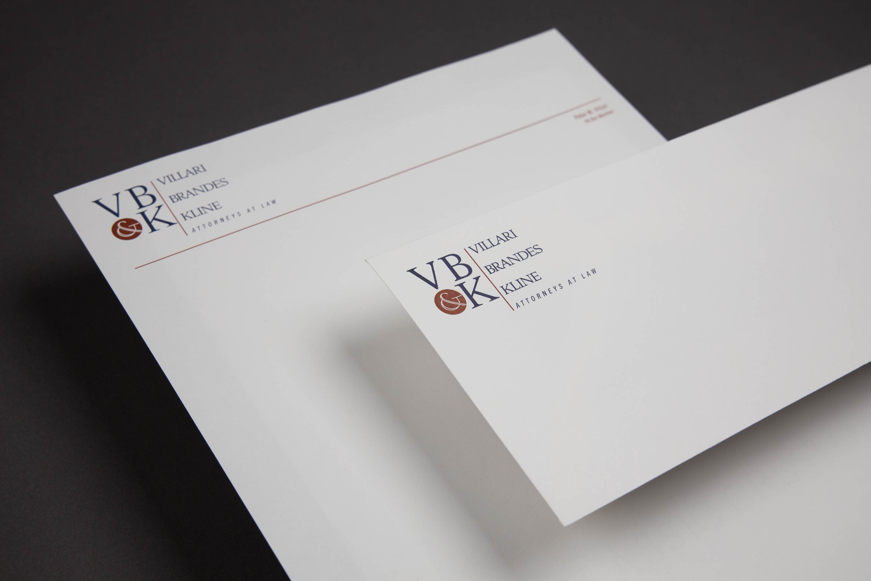
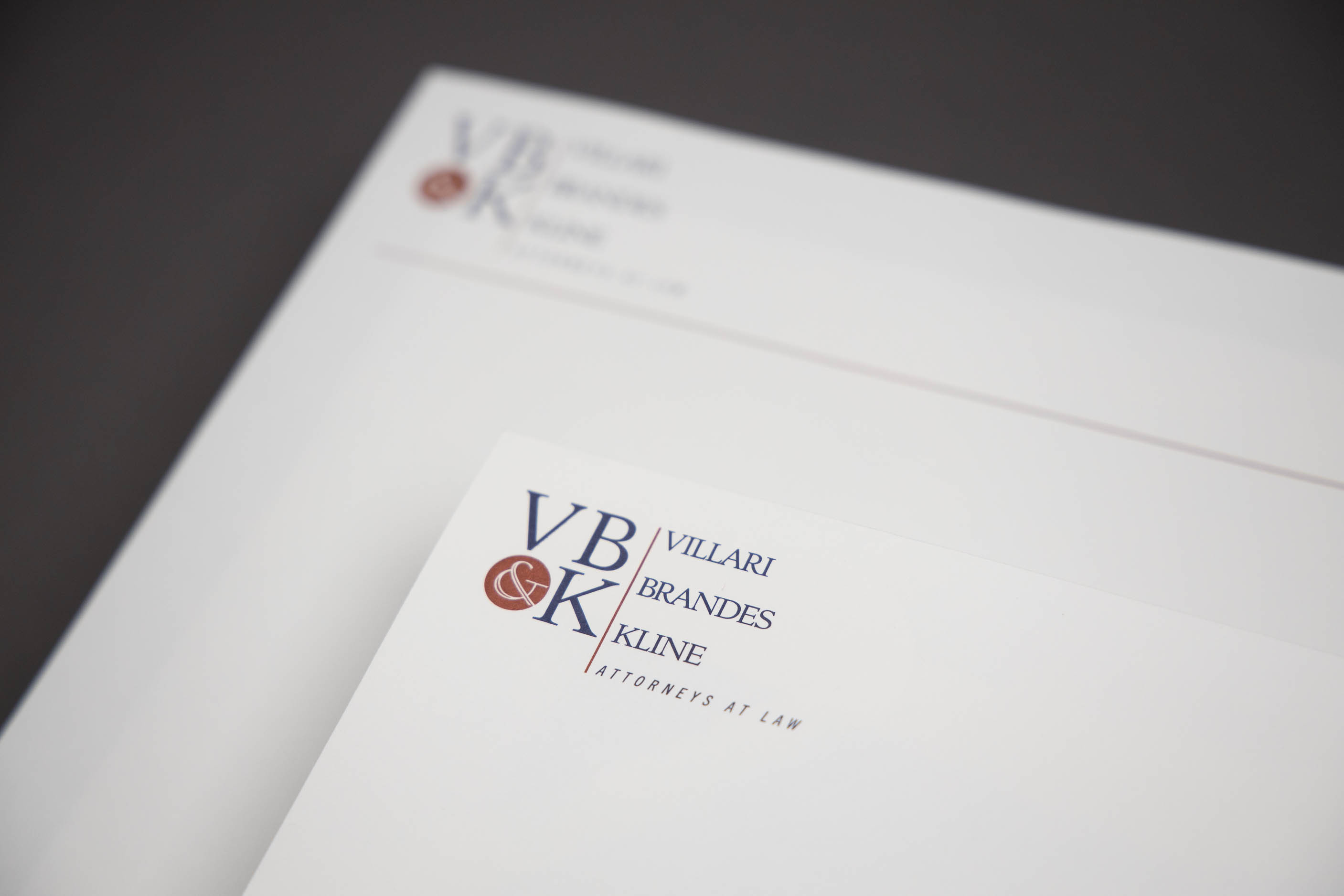
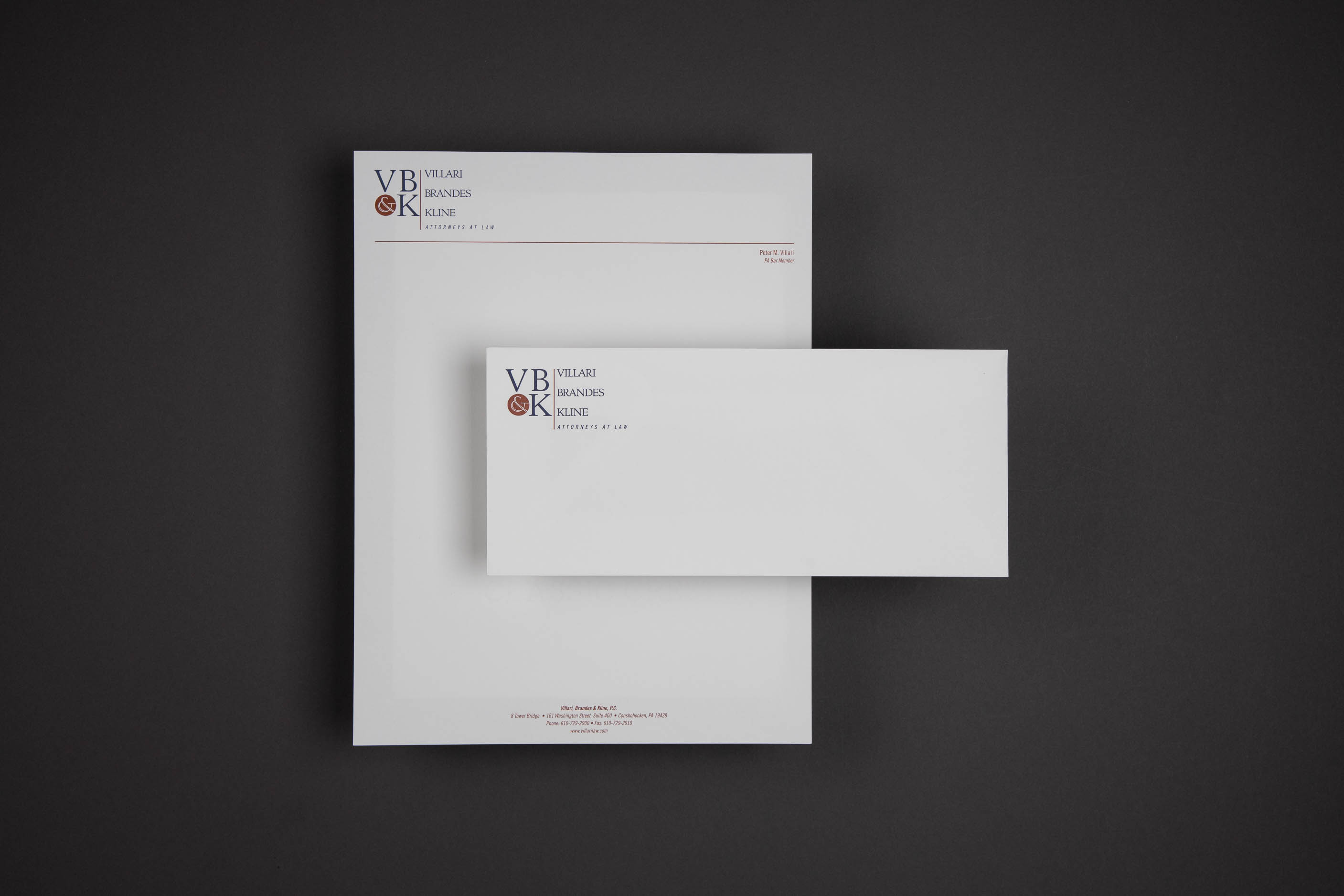
Law firm branding is often forgettable and lackluster. VB&K sought a brand identity that was simple and distinctive. Establishing a refined and approachable brand image is often more valuable than appearing “big” and “stuffy.”


A solid red circle holding the ampersand strikes a strong counterbalance to the classic large initials. In most uses, the partner names stack adjacent to the monogram with a delicate red rule dividing them.

Zoom with Us
Talk to our creative team about creating your best brand.
Set up a video call.
visit us
Come in to discuss a project. Create a brand people can value, admire and maybe even love.
Get candid advice.
Get your brand working.
Schedule a meeting.